
US public pension funds beyond 60/40
How a $5.44 trillion market moved into alternatives, and what the shift means for liquidity and long-term returns.
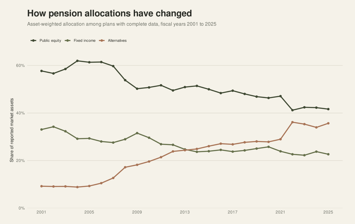
Asset allocation across US public pension funds has changed substantially since the start of the century. Since 2001, alternatives have risen from 9.2% to 35.7% of reported assets, while public equity and fixed income have both fallen well below the 60% and 40% weights associated with the traditional 60/40 portfolio.
The shift matters beyond the portfolio mix. More capital is now held in investments that are less readily valued or sold, and mature plans, which also need dependable cash flow to pay benefits, hold the highest allocations. This analysis uses Public Plans Data to examine how the move into alternatives relates to plan characteristics and reported returns.
The dataset covers 254 major state and local pension systems with $5.44 trillion in combined reported market assets. Public Plans Data states that its sample represents 95% of public pension membership and assets nationwide, giving a broad view of how public pension capital is managed across the United States. Each comparison includes the systems that report the necessary data; missing values are not counted as zero.
The largest US public pension funds
The ten largest systems hold 40.7% of all market assets reported in the dataset. CalPERS is the largest, with USD 563.0 billion, followed by CalSTRS with USD 370.2 billion. The New York State and Local Employees’ Retirement System, TRS of Texas and the Florida Retirement System each report more than $200 billion.
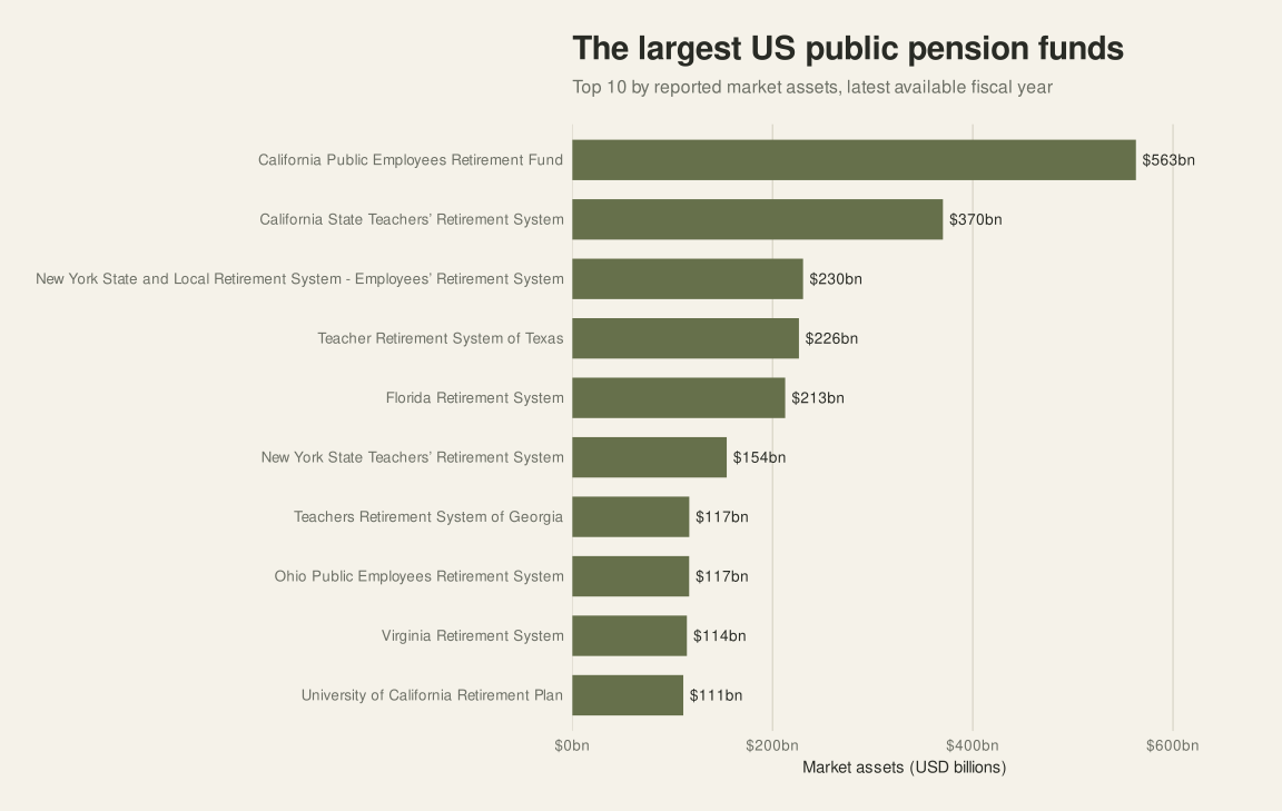
The market is concentrated at the top, but it extends well beyond the largest systems. The median reporting plan holds $11.3 billion, and the dataset includes statewide systems, municipal plans and separate plans for teachers, public employees and public-safety workers.
Top 10 US public pension funds by assets
| Rank | Pension fund | Reported market assets |
|---|---|---|
| 1 | California Public Employees’ Retirement System (CalPERS) | $563.0bn |
| 2 | California State Teachers’ Retirement System (CalSTRS) | $370.2bn |
| 3 | New York State and Local Employees’ Retirement System (ERS, part of NYSLRS) | $230.5bn |
| 4 | Teacher Retirement System of Texas (TRS of Texas) | $226.3bn |
| 5 | Florida Retirement System (FRS) | $212.6bn |
| 6 | New York State Teachers’ Retirement System (NYSTRS) | $154.2bn |
| 7 | Teachers Retirement System of Georgia (TRS Georgia) | $116.8bn |
| 8 | Ohio Public Employees Retirement System (OPERS) | $116.7bn |
| 9 | Virginia Retirement System (VRS) | $114.4bn |
| 10 | University of California Retirement Plan (UCRP) | $110.8bn |
How US public pension funds are invested
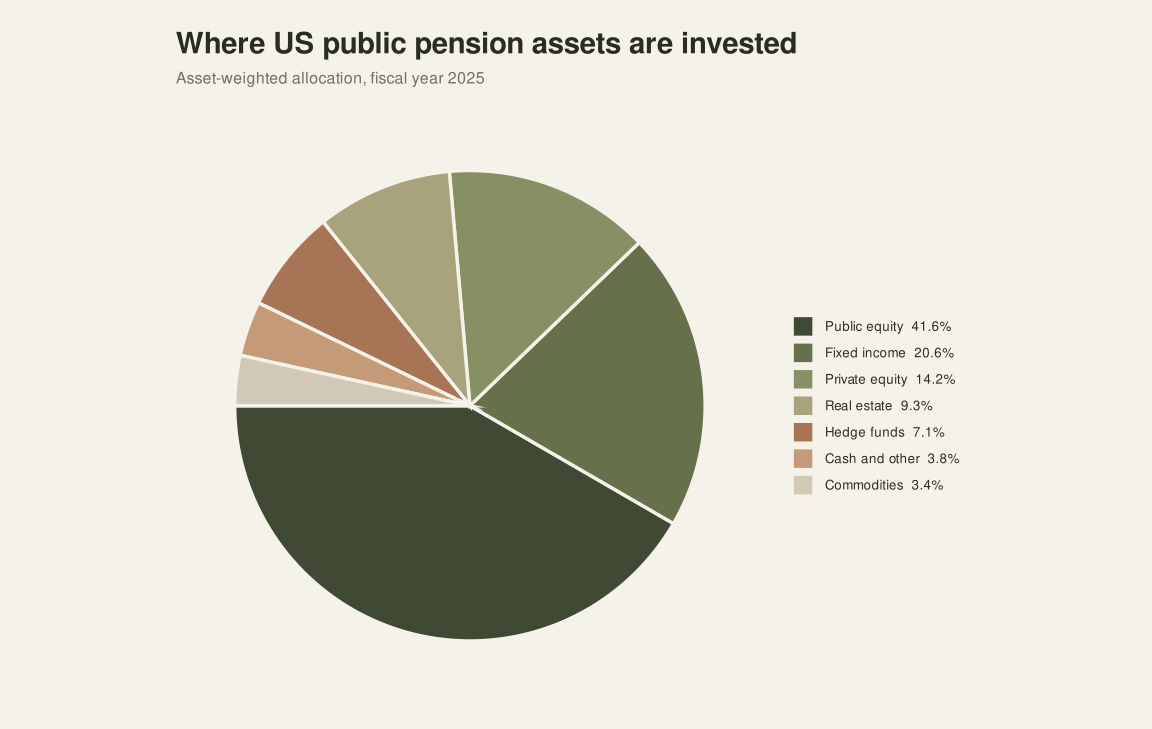
Among the 131 systems with market assets and a complete allocation breakdown for 2025, public equity accounts for 41.6% of assets. Fixed income represents 22.7%, followed by private equity at 14.2%, real estate at 9.3% and hedge funds at 7.1%. Weighted by each system's reported assets, the figures cover $4.93 trillion.
Broad asset-class view
The individual allocations fall into three broad classes. Public equity covers listed shares, fixed income covers bond-oriented holdings, and alternatives includes private equity, real estate, hedge funds, commodities and other alternative strategies.
| Asset class | Share of reported market assets | Includes |
|---|---|---|
| Public equity | 41.6% | Listed equity holdings |
| Fixed income | 22.7% | Fixed-income holdings |
| Alternatives | 35.7% | Private equity, real estate, hedge funds, commodities and other assets |
US public pension asset allocation since 2001
| Asset class | 2001 | 2025 | Change |
|---|---|---|---|
| Public equity | 57.7% | 41.6% | -16.1 percentage points |
| Fixed income | 33.1% | 22.7% | -10.4 percentage points |
| Alternatives | 9.2% | 35.7% | +26.5 percentage points |
Public equity fell by 16.1 percentage points between 2001 and 2025, while fixed income declined by 10.4 points. Alternatives absorbed the difference, rising from 9.2% to 35.7%.
What changed within alternatives?
| Asset class | 2001 | 2025 | Change |
|---|---|---|---|
| Private equity | 3.8% | 14.2% | +10.4 percentage points |
| Hedge funds | 0.3% | 7.1% | +6.7 percentage points |
| Real estate | 4.6% | 9.3% | +4.7 percentage points |
| Commodities | 0.0% | 3.4% | +3.4 percentage points |
| Other alternatives | 0.4% | 1.6% | +1.2 percentage points |
| Other | 0.1% | 0.1% | No material change |
Private equity contributed the largest increase within alternatives, followed by hedge funds, real estate and commodities. Together, these four categories gained approximately 25.2 percentage points between 2001 and 2025.
The annual figures are weighted by reported market assets and include systems with a complete allocation for that fiscal year. The number of reporting systems varies over time and stands at 131 in 2025, so recent changes reflect both portfolio decisions and the plans represented in the data.
Which plans invest most in alternatives?
Alternatives are more common in larger, older and more mature pension plans.
Plan maturity is measured here by the share of beneficiaries in the combined active-member and beneficiary population.
The pattern appears across five plan characteristics:
| Plan characteristic | Correlation with alternative allocation |
|---|---|
| Beneficiary share | 0.241 |
| Actuarial liabilities | 0.180 |
| Market assets | 0.159 |
| Plan age | 0.157 |
| Payroll | 0.127 |
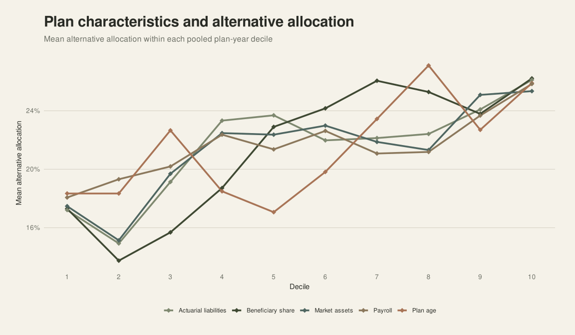
The difference is clearest near the bottom of the market. Smaller and less mature plans allocate markedly less to alternatives. From the middle deciles onward, allocations remain in a higher range and additional scale matters less.
Scale helps explain the pattern. Large systems can spread commitments across managers and investment years, maintain dedicated investment teams, negotiate access and fees, and plan benefit payments across a broader pool of assets and contributions. These capabilities make illiquidity easier to manage and absorb.
Maturity presents a different question. Plans with the highest beneficiary shares have the greatest need for dependable cash flow, yet beneficiary share has the strongest relationship with alternative allocation. Plans further into their payment years are also committing more capital to assets that may not be readily sold when cash is needed.
Size does not account for this pattern on its own. Across the pooled observations, beneficiary share has little linear relationship with market assets, with a correlation of -0.019, or with actuarial liabilities, at 0.029. For mature plans with higher alternative allocations, the relationship between illiquidity and returns becomes especially relevant.
Do alternative investments improve pension fund returns?
Reported returns rise with alternative allocation, although the relationship varies by horizon. Plans in the highest alternative-allocation decile report an average ten-year return of 7.50%, compared with 7.18% in the lowest decile. The difference is positive but modest at 0.31 percentage points, with a correlation of 0.019.
The five-year results are clearer. Average returns rise from 6.28% in the lowest decile to 7.78% in the highest, a difference of 1.50 percentage points. Plans with larger alternative allocations therefore show stronger performance over five years and a smaller advantage over ten.
| Reported return | Lowest alternative-allocation decile | Highest alternative-allocation decile | Difference |
|---|---|---|---|
| One year | 6.46% | 7.76% | +1.30 percentage points |
| Five years | 6.28% | 7.78% | +1.50 percentage points |
| Ten years | 7.18% | 7.50% | +0.31 percentage points |
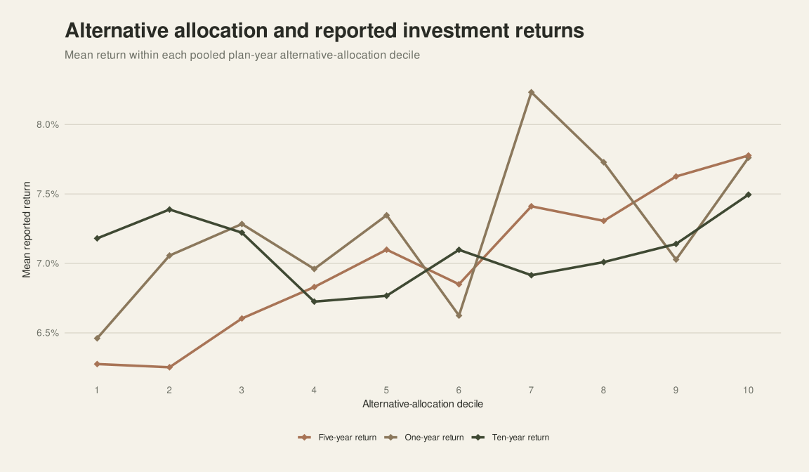
The return advantage is meaningful over five years and more limited over ten. For plans holding substantial allocations to alternatives, the ability to manage liquidity through the full investment cycle remains central.
Conclusion
Public pension portfolios have shifted substantially away from their traditional public-equity and fixed-income mix. Alternatives rose from 9.2% of reported assets in 2001 to 35.7% in 2025, while public equity and fixed income both lost share.
The move has also changed the risks pension systems carry. More capital is now committed to assets that are less readily valued or sold. Mature systems allocate the most to alternatives even as they face greater demands for dependable cash flow. Reported returns point to a positive payoff, clearer over five years and more modest over ten.
About the data
The market-size comparisons use the latest available Public Plans Data observation for each system. The current allocation and allocation history use fiscal-year observations through 2025. The plan-characteristic and return comparisons pool all available plan-year observations, pairing allocation and reported returns within the same observation. Size correlations use logarithmic values, while maturity measures are winsorized at the 1st and 99th percentiles. Missing values are excluded only from calculations that require the missing field.
- Source: Public Plans Data, 2001-2025. Center for Retirement Research at Boston College, MissionSquare Research Institute, National Association of State Retirement Administrators, and Government Finance Officers Association.
- Coverage: 254 US public pension systems
- Size observation: Latest available
- Allocation observation: Fiscal year 2025
- Currency: US dollars
- Market-asset unit in the source: USD thousands
- Last updated: October 2026
Figures may differ from values published subsequently by pension systems because of reporting dates, revisions and differences in classification. Portfolio categories and return definitions may also differ between systems. Soborro presents the source data for comparison and does not provide actuarial or investment advice through this page.